
首先提出一个核心观点:文献配图的精髓并不仅仅是将训练集与测试集的散点简单地绘制在画布上。其真正价值在于,在同一个坐标系中,将最优模型与其他候选模型进行直观的“面对面”对比,从而揭示预测性能的差异。
常见的回归散点图相信大家都不陌生——在同一画布上同时展示训练集和测试集中预测值与实验值之间的对应关系,散点越接近对角线(y=x),预测精度越高。然而,仅停留在这一层面,信息量往往不足。更具洞察力的做法是,在此基础上将RF、XGBoost、CatBoost等模型分别与核心模型(如GP-BT)进行对比,并利用置信椭圆描绘特定区间内散点的分布范围、集中程度以及偏差方向,从而揭示局部预测误差结构。
置信椭圆越小且越贴近对角线,表明该模型在对应区间内预测稳定性越好、误差越小;若椭圆偏离对角线,则提示可能存在系统性的高估或低估。因此,这种绘图方式不仅展示整体拟合效果,更能深入揭示不同模型在局部预测区间内的误差结构和稳定性差异。结合右侧的真实样本散点图以及RMSE、MAE柱状图,外部验证数据的泛化表现也能一目了然。
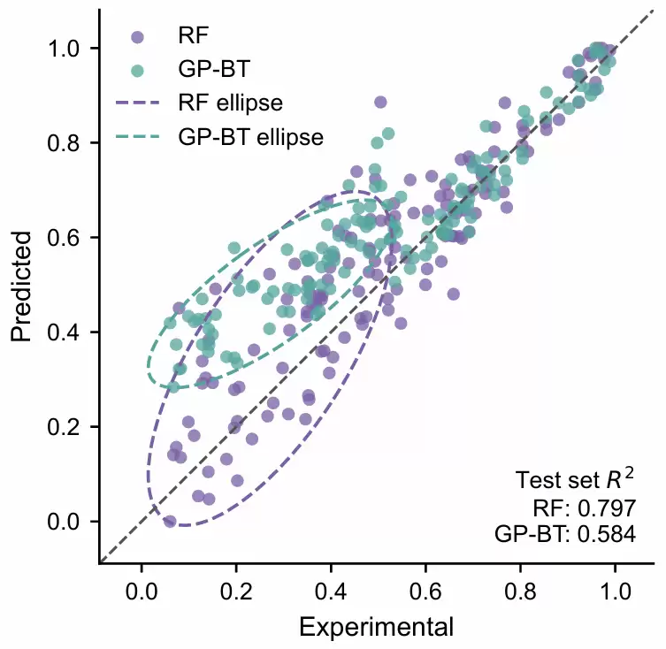
该图是基于模拟数据的一个典型演示。在同一测试集上,同时展示了RF与GP-BT的预测散点、分区间置信椭圆以及整体拟合优度指标。散点越靠近灰色虚线y=x,表明预测值越接近真实值。从整体来看,RF的测试集拟合优度高于GP-BT,这意味着在整体测试集上RF的拟合性能更优。
然而,仅看整体拟合优度还不够。进一步观察置信椭圆,可以发现更多有价值的信息:RF的紫色椭圆较大,覆盖了从低值到中值的范围,表明该区间内RF的预测结果波动较大,但整体趋势仍可接受;而GP-BT的青绿色椭圆更扁、更集中,显示出更强的局部预测稳定性,但椭圆整体位于y=x上方,提示在该区间存在一定的高估倾向。
基础代码
import pandas as pd
import numpy as np
import matplotlib.pyplot as plt
plt.rcParams['font.family'] = 'Times New Roman'
plt.rcParams['axes.unicode_minus'] = False
import warnings
# 忽略所有警告
warnings.filterwarnings("ignore")

path = r"2026-6-11公众号Python机器学习AI.xlsx"
df = pd.read_excel(path)

from sklearn.model_selection import train_test_split
target = 'SR'
X = df.drop(columns=[target])
y = df[target]
X_train, X_test, y_train, y_test = train_test_split(
    X, y,
    test_size=0.2,
    random_state=42
)

from xgboost import XGBRegressor
from sklearn.tree import DecisionTreeRegressor
from sklearn.model_selection import GridSearchCV, KFold

# K折交叉验证
kfold = KFold(
    n_splits=5,
    shuffle=True,
    random_state=42
)

xgb_model = XGBRegressor(
    random_state=42,
    objective="reg:squarederror"
)

xgb_param_grid = {
    "n_estimators": [100, 200, 300],
    "max_depth": [2, 3, 4, 5],
    "learning_rate": [0.01, 0.05, 0.1],
    "subsample": [0.8, 1.0],
    "colsample_bytree": [0.8, 1.0]
}

xgb_grid = GridSearchCV(
    estimator=xgb_model,
    param_grid=xgb_param_grid,
    scoring="r2",
    cv=kfold,
    n_jobs=-1,
    verbose=1
)

xgb_grid.fit(X_train, y_train)

best_xgb_model = xgb_grid.best_estimator_

print("Best XGBoost parameters:")
print(xgb_grid.best_params_)
print("Best XGBoost CV R2:", xgb_grid.best_score_)

dt_model = DecisionTreeRegressor(
    random_state=42
)

dt_param_grid = {
    "max_depth": [2, 3, 4, 5, 6, None],
    "min_samples_split": [2, 5, 10],
    "min_samples_leaf": [1, 2, 4, 8],
    "criterion": ["squared_error", "friedman_mse"]
}

dt_grid = GridSearchCV(
    estimator=dt_model,
    param_grid=dt_param_grid,
    scoring="r2",
    cv=kfold,
    n_jobs=-1,
    verbose=1
)

dt_grid.fit(X_train, y_train)

best_dt_model = dt_grid.best_estimator_

print("Best Decision Tree parameters:")
print(dt_grid.best_params_)
print("Best Decision Tree CV R2:", dt_grid.best_score_)

y_pred_xgb = best_xgb_model.predict(X_test)
y_pred_dt = best_dt_model.predict(X_test)
Fitting 5 folds for 144 candidates, totalling 720 fits
Best XGBoost parameters:
{'colsample_bytree': 1.0, 'learning_rate': 0.05, 'max_depth': 3, 'n_estimators': 100, 'subsample': 0.8}
Best XGBoost CV R2: 0.8760164066661537
Fitting 5 folds for 144 candidates, totalling 720 fits
Best Decision Tree parameters:
{'criterion': 'squared_error', 'max_depth': 5, 'min_samples_leaf': 8, 'min_samples_split': 2}
Best Decision Tree CV R2: 0.8413786537234579
首先读取数据,确定目标变量,划分训练集与测试集,随后分别采用5折交叉验证网格搜索优化XGBoost与决策树回归模型。最终获得两个最优模型在测试集上的预测结果,整个过程简洁高效。
plot_scatter_with_range_confidence_ellipse(
    y_test,
    y_pred_xgb,
    y_pred_dt,
    base_name="XGBoost",
    gp_name="DT",
    base_ellipse_range=(0, 50),   # 第一个模型椭圆使用这个区间
    gp_ellipse_range=(20, 70),    # 第二个模型椭圆使用这个区间
    legend_loc="upper left",
    sa ve_path="scatter_1.pdf"
)
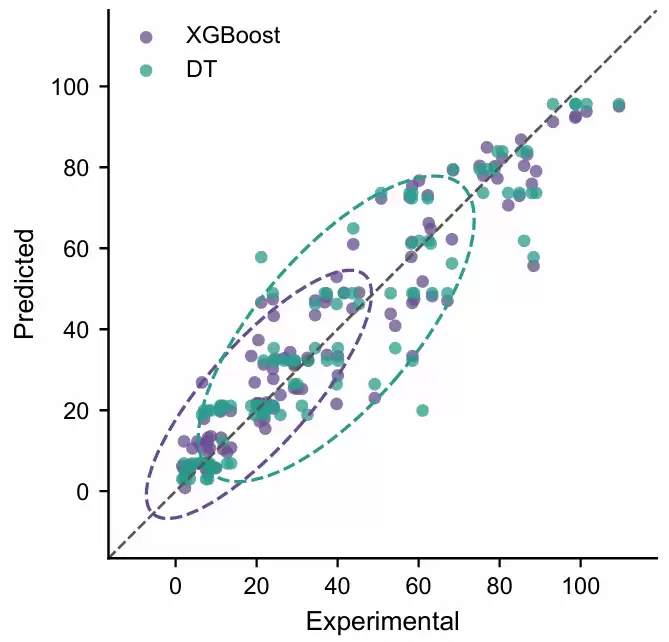
将测试集真实值与XGBoost和DT两个模型的预测值绘制在同一张回归散点图中,并分别在指定区间(0, 50)和(20, 70)上添加置信椭圆。目的非常明确:直观比较两个模型在不同真实值区间内的预测分布、稳定性及偏差情况。
plot_scatter_with_range_confidence_ellipse(
    y_test,
    y_pred_xgb,
    y_pred_dt,
    base_name="XGBoost",
    gp_name="DT",
    base_ellipse_range=(5, 50),
    gp_ellipse_range=(50, 100),
    base_scatter_color="#9ECAE1",   # XGBoost 散点:浅蓝
    gp_scatter_color="#FDBE85",     # Decision Tree 散点:浅橙
    base_ellipse_color="#3182BD",   # XGBoost 椭圆:深蓝
    gp_ellipse_color="#E6550D",     # Decision Tree 椭圆:深橙
    legend_loc="upper left",
    sa ve_path="scatter_2.pdf"
)
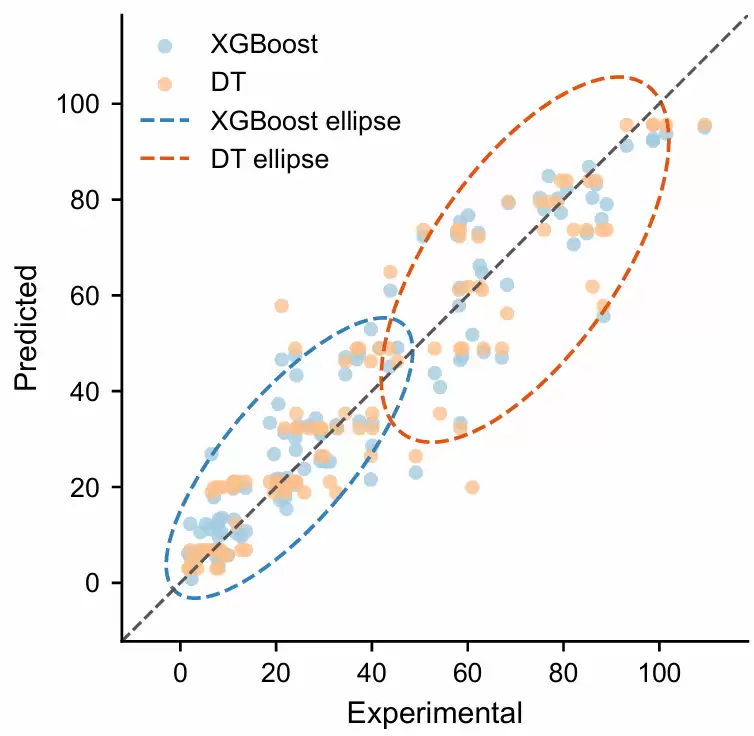
这一版在上一张图的基础上做了两处关键调整:第一,将两个模型的置信椭圆区间设为不同范围;第二,分别为散点和椭圆指定了同色系但深浅不同的配色。这样做的优势显而易见——避免默认“散点与椭圆同色”时辨识度不足,从而更清晰地比较XGBoost与DT在不同真实值区间内的预测分布和偏差特征。
plot_scatter_with_range_confidence_ellipse(
    y_test,
    y_pred_xgb,
    y_pred_dt,
    base_ellipse_range=(5, 50),
    gp_ellipse_range=(50, 100),
    base_name="XGBoost",
    gp_name="DT",
    base_scatter_color="#9ECAE1",
    gp_scatter_color="#FDBE85",
    base_ellipse_color="#3182BD",
    gp_ellipse_color="#E6550D",
    legend_loc="upper left",
    show_test_r2=True,
    sa ve_path="scatter_3.pdf"
)
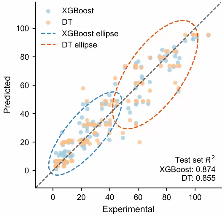
新增参数show_test_r2=True,效果是在图的右下角自动显示两个模型在测试集上的拟合优度(R²)。这样一来,散点分布、分区间置信椭圆以及整体量化指标得以同框呈现,比较XGBoost与DT的整体预测性能与局部区间误差特征变得一目了然。
具体函数参数可参考项目压缩包中的完整代码,读者可根据自身的数据范围、模型名称、配色方案、椭圆区间以及是否显示测试集R²等实际需求灵活调整。
np.random.seed(42)

n_samples = 140

x_low = np.random.uniform(0.05, 0.55, 55)
x_mid = np.random.uniform(0.35, 0.75, 45)
x_high = np.random.uniform(0.60, 1.00, 40)

y_test_demo = np.concatenate([x_low, x_mid, x_high])
y_test_demo = np.sort(y_test_demo)

y_pred_rf_demo = (
    0.08
    + 0.95 * y_test_demo
    + np.random.normal(0, 0.12, size=len(y_test_demo))
)

high_mask = y_test_demo > 0.60
y_pred_rf_demo[high_mask] = (
    y_test_demo[high_mask]
    + np.random.normal(0, 0.055, size=high_mask.sum())
)


y_pred_gpbt_demo = (
    0.28
    + 0.72 * y_test_demo
    + np.random.normal(0, 0.075, size=len(y_test_demo))
)

mid_high_mask = y_test_demo > 0.55
y_pred_gpbt_demo[mid_high_mask] = (
    y_test_demo[mid_high_mask]
    + np.random.normal(0, 0.035, size=mid_high_mask.sum())
)

# 限制在 0-1 范围内
y_pred_rf_demo = np.clip(y_pred_rf_demo, 0, 1)
y_pred_gpbt_demo = np.clip(y_pred_gpbt_demo, 0, 1)


plot_scatter_with_range_confidence_ellipse(
    y_test_demo,
    y_pred_rf_demo,
    y_pred_gpbt_demo,
    base_ellipse_range=(0.05, 0.45),   # RF 椭圆:低值区间
    gp_ellipse_range=(0.05, 0.45),     # GP-BT 椭圆:中低值区间
    base_name="RF",
    gp_name="GP-BT",
    base_scatter_color="#7B5EA7",      # RF 紫色散点
    gp_scatter_color="#55A6A0",        # GP-BT 青绿色散点
    base_ellipse_color="#7B5EA7",      # RF 紫色椭圆
    gp_ellipse_color="#55A6A0",        # GP-BT 青绿色椭圆
    legend_loc="upper left",
    show_test_r2=True,
    sa ve_path="demo_model_comparison.pdf"
)
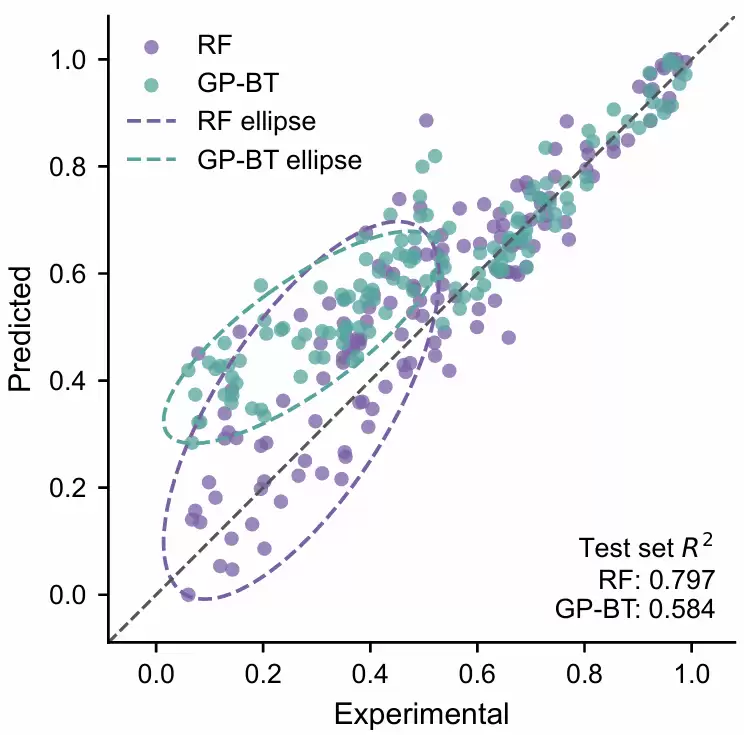
最后,我们构造一组差异更加显著的模拟数据。这样做的原因是:在实际建模中,不同模型的性能往往十分接近,置信椭圆的差异可能不够直观。通过人为设置不同的误差结构,使RF与GP-BT在局部区间内的预测稳定性、偏差方向以及整体拟合优度的差异变得更加清晰。这个模拟案例旨在更明确地展示这种可视化方法所能揭示的深层信息。

该文章案例
在上传的文件中,我们对案例进行了逐步分析,确保读者能够达到最佳的学习效果。所有内容均经过详细解读,帮助深入理解模型的实现过程与数据分析步骤,从而最大化学习成果。
同时,结合提供的免费AI网站进行学习,可以促进理论与实践之间的融会贯通,从而更全面地掌握核心概念。